Why pick the Joy Factory for my brand?
Why should you pick the Joy Factory to create a logo, update your logo or create a whole new brand for you? What makes my method different?
I have a different approach.
With my other hat, I train SMEs in social media and enable them to communicate their service themselves. When I’ve made logos or brands before, I work with the client to really pin down their passion for their service, a clear perfect customer and the most pressing problem they are solving with their business.
A logo is one outcome of this work. I don’t just pick some random purple square with some blocky font for a client. The font, colours, illustration or ident that are created reflect the values, offering and customer of the client’s business.
If you imagine a stick of rock, the message inside is the same, wherever you break it. So it is with a logo, the way you talk at a networking event, how you write online or the design material you create, the message is always the same. Break it, and you break your promise with your customer. They probably won’t complain, they just won’t come back.
How does it work?
I start the process by meeting informally with a client to understand their business. If they are interested in working with me, I will send them a brief guideline document for them to give me a brief to write a proposal.
From there we will have an hour consultation and then create a joint Pinterest board with pins that reflect the information we gathered together, i.e. brands they like, nice fonts, colours, photography; nothing is off limits or wrong at this stage.
After the client has created a Pinterest board with me, I either work with the client to create the logo together, i.e. choosing the colours, fonts, icon etc, or I can do this as studio time.
The work at the end is a logo and a brand guidelines sheet (colour pallete, logo masters, font family and use of imagery and voice). But it could also be social media avatars, graphics for the website, printed material and many more depending on your needs and budget. A brand is far more than a logo.
Some examples of my Design Method
To demonstrate this, here is a little story about how I came up with my brand for Joy Factory.
The idea I had for the brand was something that tapped into nostalgia and fun (well, the company is the ‘Joy Factory’, after all.) I wanted a font that was sustainable (Clarendon is a design classic now) and a colour pallete that wouldn’t date massively either.
So, I decided to go to the Museum of Childhood, in Bethnal Green, to take pictures of vintage toys. I then used a nifty tool called ‘Photocapa‘, where you can pick a pallete from a image of your choice.
Here is a photo of some vintage playing cards, and the colours I picked from this image.

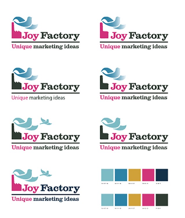
I then gathered ideas for what a Joy Factory would look like on a Pinterest board (which I use for my own projects as well as my clients). I came up with the idea of a productive factory with a smoke plume, which is also a bird flying (showing the joyful and spirited side.)


From this, I created some ideas for the logo and colour pallete and asked every client I met which was the best option. This was the original logo:

This has evolved this year to a new design, with a slight update on the colours (this time taken from an 80s keyboard!)

Please fill out a form below if you’re interested in creating a brand that works.
